
Editorial search optimization
PRODUCT DESIGN
QUALITATIVE USER RESEARCH
A/B TESTING
I designed the feature that reduced the amount of visually repetitive images and helped users find their desired images faster, through providing low and high-fidelity prototypes, strategizing qualitative user research and synthesis, and delivering data-backed design improvements for A/B testing.
TIMELINE
3 weeks design
2 weeks user research
TOOL
Figma
Userlytics
ROLE
Product design
Research strategy & synthesis
PROJECT BACKGROUND
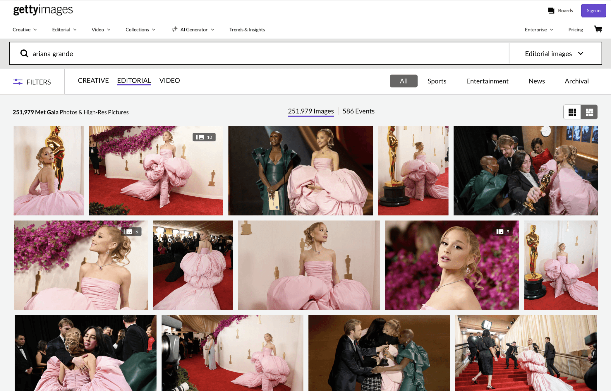
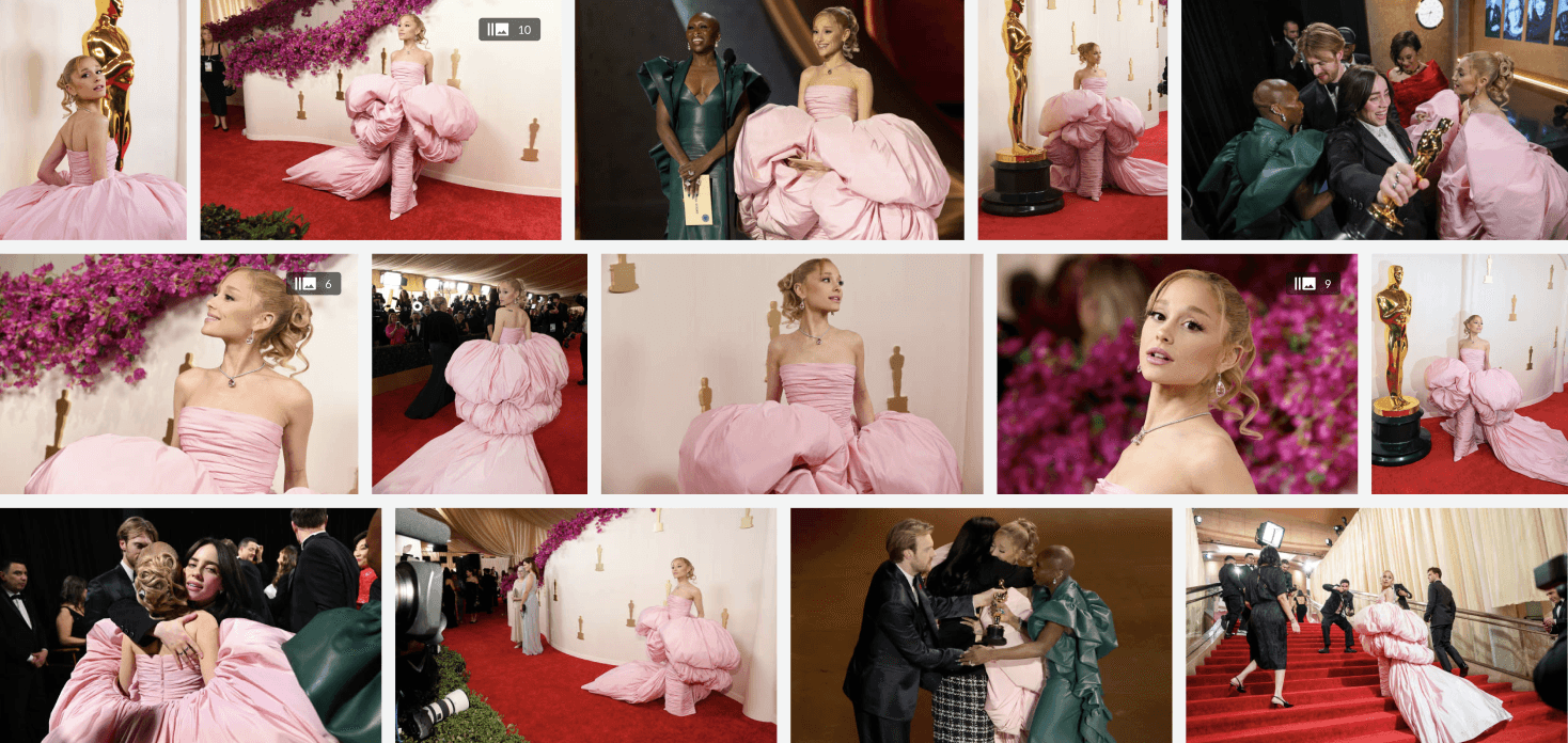
A large potion of Editorial users come to Getty Images to find the most recent images related to a personality or event. While Getty provide a broad range of visuals, users sometimes have to browse through multiple pages of visually similar images before finding the ones they need. This feature is developed as a part of a long term goal to optimize Getty's Editorial search experience.
GOAL
Design a user flow that enables users to group visually similar images together in the search results page, helping users to browse through a wider variety of visuals and find their desired images faster.
Design directions
I proposed several design directions for alignment with stakeholders and cross functional partners, two of which are shown below.
DIRECTION 1
Users can group similar images by using a toggle inside the filter panel, and view the grouped images inside a popup modal.
DIRECTION 2
Users can group similar images using a link above the search results, preview grouped images on hover, and view all grouped images in the asset detail page.
User research
During the design process, the team was concerned that hiding images from the search results can risk introducing a fear of missing out and break users' trust. To gain a clearer understanding of the desirability and user behavior around the proposed feature, I worked with the team's user researcher to strategize a study to address those concerns.
RESEARCH GOALS
Understand whether showing more variety in serach results will help users find images easily.
Understand if the location for viewing visually similar content match user expectations.
RESEARCH METHOD
Qualitative user research
Unmoderated testing with prototypes
17 participants
RESEARCH LEARNINGS
DESIRABILITY
Seeing a wider variety of images is beneficial for users who aren’t looking for highly specific visuals.
Being able to compare similar images helps users select the best image for their projects.
LOCATION
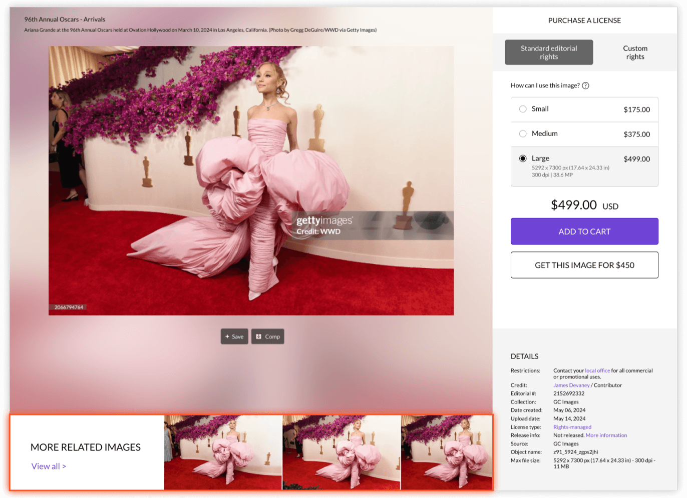
Majority of customers had difficulties finding the “More Related Images” section
Customers like the experience of seeing visually similar content in the carousel once they found it.
KEY FEATURES

Group related images
Clear visual indication is essential to signal for additional content.
Users want to control when they see more image variety.
Design proposals following research learnings
After synthesizing the research data, I used the findings to inform the design of MVP that reduces the engineering effort needed to provide us with initial A/B testing results. I also proposed additional enhancements that better addresses the frictions discovered in the qualitative research.
MINIMUM VIABLE PRODUCT FOR A/B TESTING
ADDITIONAL DESIGN PROPOSALS
Animated tooltip.
Gallery showing similar images with enhanced visibility.
Visual modal to help clarify the feature to users.
IMPACT
The initial test results showed positive results: download rate increased by 5%, first interaction depth decreased by 17%, maximum interaction depth decreased by 11%, and maximum download depth decreased by 16%.
NEXT STEPS
After proving the value of this feature through both qualitative and initial quantitative testing, the team is now working on improving the algorithm before developing the next design iteration.